
Five things a business card has to carry
A card gets about four seconds of attention and then it goes in a pocket or in a bin. These five things decide which — and the fifth is the one almost everybody leaves off.
Delta Media Services Business CardsStationery
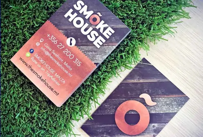
Your business is more to you than a day job, and a card is the smallest, cheapest object that has to say so. It is also the one piece of print people judge by touch as well as by eye — which is why stock weight is not a detail, and why a card that flexes in the hand undoes whatever the design was trying to do.
Design comes first, though. Here is what has to be on it.
1. Your job title
Not just your name. A contact who met you at an event three weeks ago remembers a conversation, not a role. The title is what tells them whether you are the person to call about this particular thing — and it is what gets you passed sideways to somebody else in their office who needs exactly what you do.
2. Contact information
A phone number, an email, a website, your social profiles. All of them, and all of them current.
The most common fault we see is a card that carries one channel. Different people reach out in different ways, and the one you left off is the one they wanted.
3. A visual
Your logo, or a photograph of you.
A mark is the usual answer and it works because it is the same mark on your van, your shopfront and your invoice — the card joins a system the recipient has already seen. A photograph works in trades where the relationship is with a person rather than a company: estate agents, brokers, consultants. What does not work is neither, which leaves a rectangle of text nobody can place.
4. Breathability
White space. It is not wasted space, and a card that uses it does not look emptier — it looks more expensive.
Crowding is what happens when a card is asked to carry a services list, an opening-hours table and three addresses. If that material has to exist, it belongs on the back of a folded card or on a step sheet, not squeezed into the margins of the front.
5. A message on the back
This is the one almost everybody leaves blank, and it is the cheapest space on the card. A motto, a tagline, a line worth keeping. One sentence that says what you actually do, for someone who is looking at the card a month later and cannot remember.
Colour is not decoration
A dash of colour adds flair and it adds meaning at the same time. Choose colours that illustrate what the company is: if the business is bright and fun, the card should be too, and if it is not, a card pretending otherwise sets an expectation the first meeting has to walk back.
And before any of it — the logo
A great business card needs a great logo first. There is no layout that rescues a weak mark at 85 × 55 millimetres; the card only ever reproduces what it is given, smaller. Choosing a smart, well-crafted mark is the simplest and most effective form of marketing a business can invest in, and it is genuinely the first step in designing a card worth handing over.